Form builder
The builder is where you assemble your form. You drag fields onto a canvas, fine-tune each one in a side panel, and preview exactly what respondents will see — all without leaving the page. It opens at /forms/build whenever you create or edit a form.
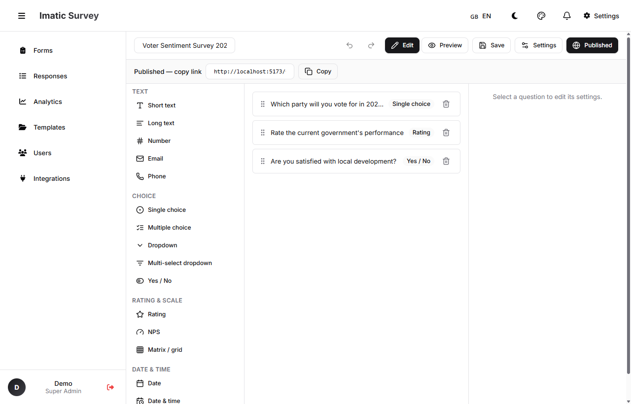 The builder's three columns: Palette on the left, Canvas in the middle, Inspector on the right.
The three columns
The builder is split into three working areas:
- Palette (left) — every available field type, grouped by kind. Drag one onto the canvas to add it.
- Canvas (middle) — your form as it's being built. This is where you arrange and select fields.
- Inspector (right) — the settings for whatever field you've selected. Change its label, mark it required, add options, attach logic, and more.
Add a field
Drag a field from the Palette onto the Canvas, or drop it between two existing fields to place it exactly where you want. The new field is selected automatically so you can edit it right away in the Inspector.
Select and edit a field
Click any field on the Canvas to select it. The Inspector updates to show that field's settings. See Field types for what each field offers, and Logic & scoring for conditional rules and scoring.
Reorder and remove fields
Drag a field up or down on the Canvas to reorder it. Remove a field from the Canvas when you no longer need it. If you remove something by accident, undo brings it back.
Undo and redo
Made a change you didn't mean to? Use undo to step back and redo to step forward. The builder tracks your edits so you can experiment freely without fear of losing work.
Multi-page forms
Long forms read better when broken into pages. Split your questions across multiple pages so respondents see a manageable chunk at a time, with a progress bar to show how far they've come. You can also route people to different pages based on their answers — see routing in Logic & scoring.
Live preview
Preview shows your form exactly as a respondent will experience it, with two layouts to choose from:
- Classic — all questions laid out on the page, scrolling top to bottom.
- Conversational — one question at a time, Typeform-style, with a guided flow.
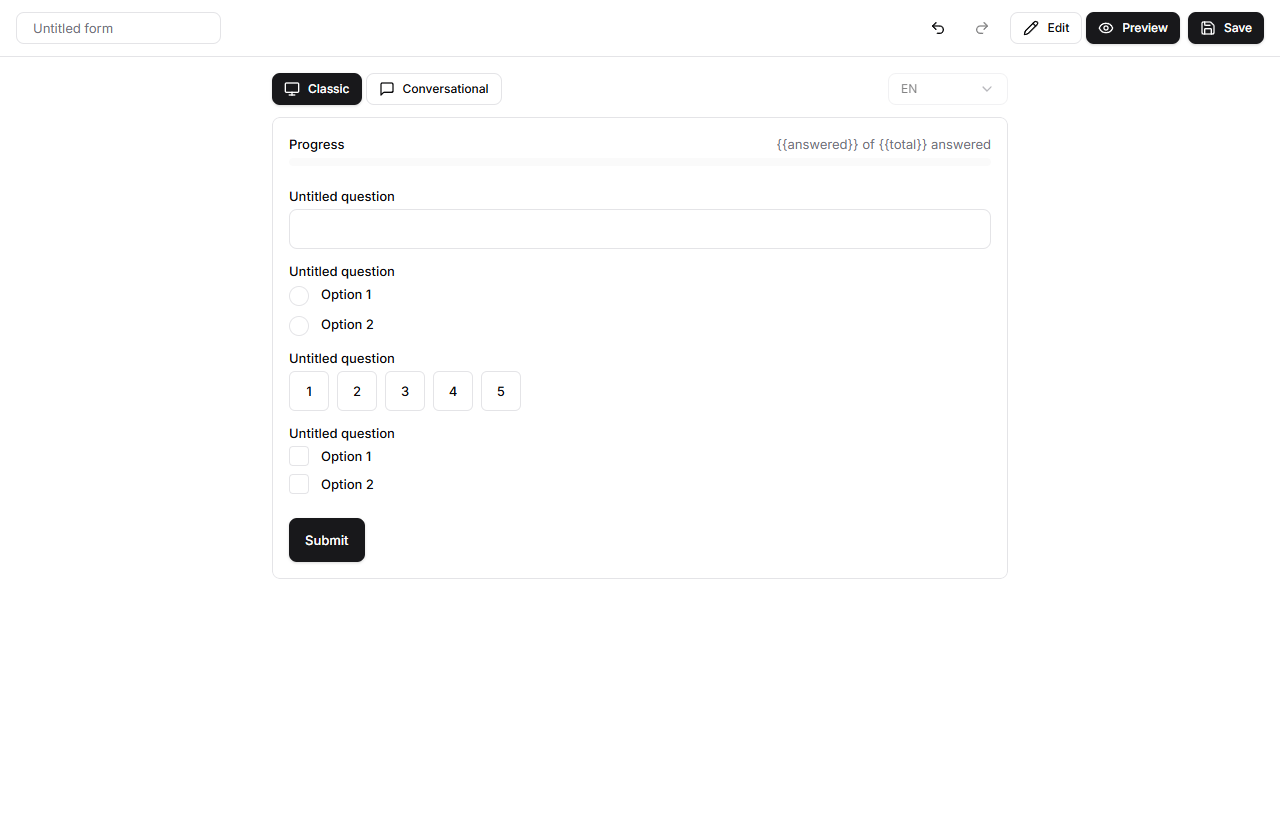 Live preview lets you check the respondent's view in classic or conversational layout before you publish.
Run through the preview to catch typos, confusing wording, and logic gaps before anyone sees the real thing.
Autosave
The builder saves your work as you go, so a dropped connection or a closed tab won't cost you progress. You can still use Save to save on demand whenever you want a deliberate checkpoint.
The builder toolbar
Four actions sit at the top of the builder:
- Save — save the current draft.
- Publish — make the form live and generate its share link. See Publish & share.
- Share — open the share dialog for the published link, QR code, and embed code.
- Settings — open Form Settings (below).
Form Settings
Open Settings to control how the whole form behaves, not just one field. From here you can set:
- Display mode — classic or conversational layout.
- Progress bar — show or hide progress as respondents move through.
- Shuffle questions — randomize question order to reduce ordering bias.
- Custom thank-you message — the message shown on the confirmation screen after submit.
- Response limits / quotas — cap the total number of responses, and optionally cap responses per option of a chosen field (per-segment quotas).
- Identity mode — collect responses as Anonymous, Pseudonymous (a hashed identifier links responses without PII), or Identified.
- Scoring — turn on scoring, set the output key, and define score bands.
- Localization — add locales and pick the default language; right-to-left languages are supported.
- Branding — add a logo and header banner, set primary and accent colors, and toggle the welcome cover screen.